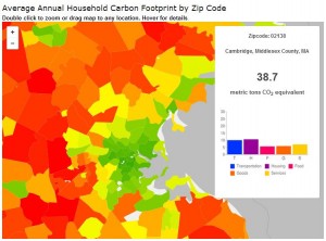
Carbon Footprint by Zip Code
Have you seen this great visualization from the Cool Climate Network? It’s household carbon footprint by zip code, based on home energy use, transportation, and consumption of goods and services. It’s really striking how green Boston and its immediate suburbs are, and how red the circle around them is. The companion carbon calculator lets you estimate your own carbon footprint more accurately.
Since taking a GIS class this fall I’m really interested in data visualization. Did you know the New York Times dialect map had the most views of any article in 2013? And it was posted on December 20! It really pushes home that we need to be thinking about more interactive ways to communicate information.
More from my site
Posted: January 24th, 2014 under Energy Use, Transportation.
Tags: carbon footprint, Cool Climate Network, data visualization, Of course Cambridge is green


